Introduction
The three individual design sheets are to record three ideas from the initial brain-storming exercise. The use of the number three is for guidance only. But it is recommended that three design sheets are created.
Too few designs mean that it is difficult to have a discussion with the client. Too many and it would waste the client's time. It may be that there are only two sensible designs, but it would be better to create a third design, however unusual or unfeasible it seems, because the client may be able to see or extend the ideas through discussion. They may be able to see an application of the idea further than you can.
Keep to the 2:3 split design of the Five Design-Sheets layout.
These design sheets should represent three completely different designs. Consider the hyperspace of possible designs, the three that you should propose should cover this design space well.
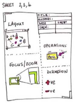
Panels
The Content of the three design sheets should all look the same, with the 5 parts. These are named “panels”.
- Layout. Also known as the Big Picture Panel, the layout panel contains picutres of what the final design would look like. Remember you could give this design to someone else to create, so you are basically saying “my design will look something like this”. So if you are building a website of many pages, you will need to include several pictures to describe the main pages of that site. If you are designing a new mobile phone App, then you should have a picture of a wire-frame mobile phone, with some content. If you are designing a powerwall, then sketch a picture of the size and shape of the display along with a typical room that it will fill. Thus your design will be showing in the place of use. In this panel you are sketching a vision of what the final visualization would look like. Commonly this would appear as a sketched screenshot of the typical visualization application. You will also need to label the parts here. As they will need to be listed out under Components/Operations.
- Focus (the Parti panel). The idea of a parti comes from architecture. It is the main underpinning concept. Think about the main essence of your idea. In this panel you will need to sketch and write about the main idea. You can also think about the part of the idea that the user will focus and spend most of their time doing. If an implementer of your design, does not include this “thing” then your design will not be suitable for use. To complete this panel, start off by writing a 2- or three-word name of the idea - by considering a few words, or a name for this idea, you will be able to consider the important aspects of the design. But also you can use this name to reference back to the idea at a later stage. Then add some sketches and words to describe the essence. There may be a few key visualization techniques, or, novel visualizations that are being created for this tool, whatever they are, they should be described in the Focus/Parti section.
- Components/Operations. Depending on what you are designing, either put a list of the component parts, or a list of the operations. So, if you are designing a new tiled screen, you could add a list a component parts. The screen itself, mounting structure, way to connect the HDMI ports to each screen, power cables and connectors, the computer requirements and way to connect it. If you are designing a new Application, you will have the several component parts, visualisations, menu items. But also, you will have some operations on those parts. Click here to select the menu, which then opens the file browser. In this case you will have Action/Result pairs. E.g., click to open a file browser. Add labels, which correspond to the Big Picture Panel, and sketches and some brief descriptions of how the user operates the visualization or controls the user interface should also be included.
- Pro/Cons and discussion. Describe the Pros and Cons of the technique. Be descriptive and justify ideas. Don't just say “it's good” say why it is good.
- Summary information. In the summary/meta-information panel, you include the general information (authors, date, sheet number and task), but also a title of the idea, and a short 2-line description of the challenge. E.g., Flood Fill Explanation could be a short descriptive title, with a description as “Designing an explanatory visualisation of the Flood Fill Algorithm, that fills polygons with pixels”.
The three middle-design sheets aid you in your discussion with the client. The sketches give the appearance that the ideas could change. Also, the designs give the client an understanding of the breadth of possible outcomes.
There are different approaches to designing the Big Picture and Parti/Focus sections of the design sheet. One method is to follow Dan Roam's suggestions of sketching designs that are Portrait, Chart, Map, Timeline, Flowchart, and plot. Each of these represent who/what, how much, where, when, how and why, respectively. Dan Roam also suggests that the designer should think whether they are simple vs elaborate diagrams, quantity, or quality, visionary or execution, individual or comparative.